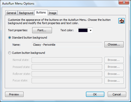
You can customize the appearance of the buttons used in the AutoRun Menu.
To customize the button appearance:
1. Customize the appearance of the text on the buttons. Click on the Font button
to customize the font face, style
and size. Click on the color drop down list to customize the color of the text.
2. Choose the button background image:
·Standard: Choose one of the button graphics included with AutoRun Architect.
1. Click on Choose.
2. A dialog will open which will allow you to browse the available button backgrounds.
3. Select one of the button backgrounds by clicking on it.
4. Click OK
·Custom: Choose custom graphics from your computer.
To use a Custom image:
1. For each of the background images click on Browse and choose an image
for the background. The graphic
needs to be in Windows Bitmap Format (*.bmp). The button has four separate background images:
·Normal state: The button background when the button is first displayed and the button is not in any other
state.
·Pressed state: The button background used when the user clicks on the button.
·Rollover state: The button background used when the most is hovering over the button.
·Focus state: The button background used when button is in focus. Focus can be moved from one button to
the other by pressing the Tab button.
To get graphics for the menu:
If you would like to get customized graphics for the menu for your company or project click on the link Click
here to
get a customized graphics for your AutoRun menu.